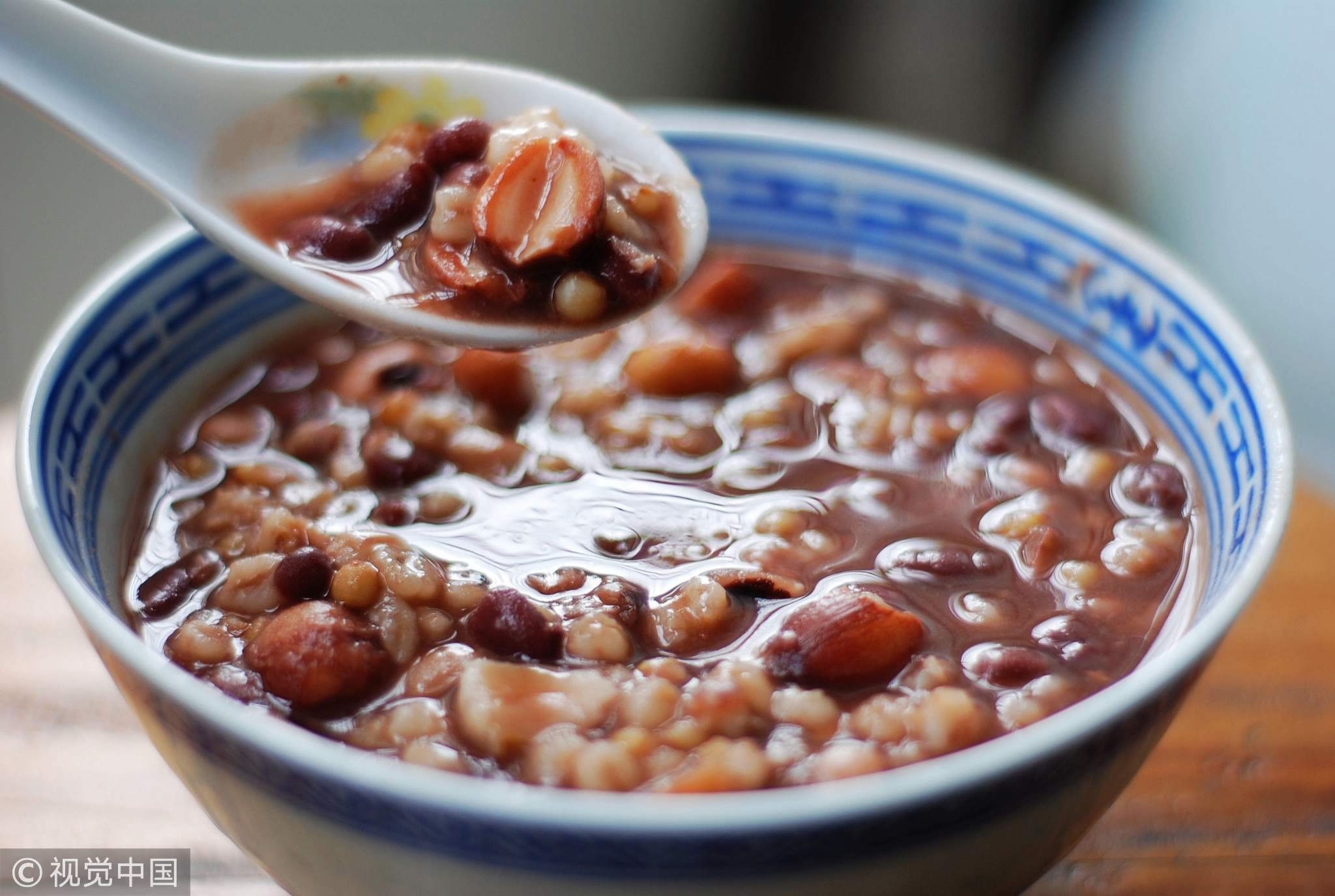
Laba Congee (腊八粥), also known as Eight Treasure Congee (八宝粥), is a traditional Chinese dish made with a mix of grains, beans, and dried fruits. It is especially associated with Laba Festival (腊八节), which falls on the eighth day of the twelfth lunar month.
For me, Laba Congee holds a special place in my heart because my grandmother used to make it when I was in China. She would carefully prepare the ingredients, soaking and cooking them for hours to bring out their rich flavors. Sitting at the table and sharing this congee with my family was always a comforting experience. To this day, making and eating Laba Congee brings back cherished memories of home and family reunions.
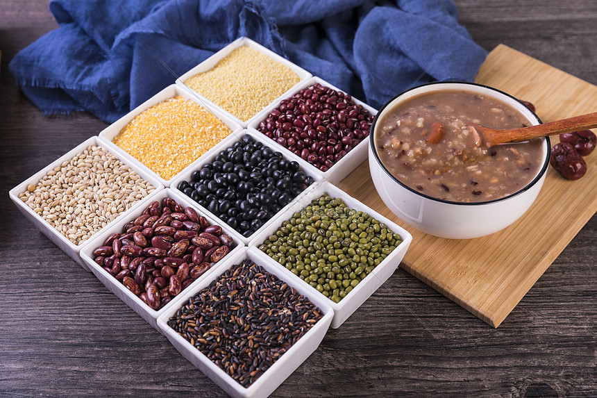
Glutinous rice – 50g
Regular rice – 50g
Red beans – 50g
Mung beans – 30g
Barley – 30g
Black rice – 30g
Lotus seeds (optional) – 20g
Peanuts – 20g
Walnuts (optional) – 10g
Dried longan (optional) – 10g
Goji berries (optional) – 10g
Rock sugar (adjust to taste) – 30g
Water – About 8 cups (2 liters)
1. Rinse all grains, beans, and nuts thoroughly with water to remove any surface impurities.
2. Soak the harder beans and grains (red beans, mung beans, barley, black rice, lotus seeds, and peanuts) in room-temperature water for at least 3 hours, or preferably overnight.
3. In a large pot, add the soaked beans and grains along with fresh water.
4. Bring the water to a boil over high heat, then reduce to low heat and let it simmer for about 1 to 1.5 hours, stirring occasionally.
5. Add the glutinous rice, regular rice, walnuts, dried longan, and goji berries about 30 minutes before the congee is done.
6. Once the congee reaches a thick, creamy consistency, stir in rock sugar and let it dissolve completely. Adjust sweetness according to taste.
7. If the congee becomes too thick, add some hot water and stir until desired consistency is reached.
8. Serve warm and enjoy with family!
This recipe is adapted and translated from Xia Chu Fang (下厨房)

This is a Japanese recipe website, and I think it is successful because of its clear structure. Right from the start, the large image makes it immediately clear what we are making. In the process section, the use of number icons instead of just text numbers is very effective, making the order of steps much clearer. Additionally, in the ingredients section, the alignment—where the ingredient name is on the left and the amount is on the right—makes it easy to match each ingredient with its corresponding measurement.
This is Gordon Ramsay’s recipe website. It is successful because, first, it also features a large image at the beginning, giving readers a clear sense of what they are cooking. The use of all capital letters for headings is also very effective—it matches Gordon Ramsay’s bold and intense style. Additionally, the way the ingredients are aligned horizontally next to the instructions allows users to easily refer back to them without having to scroll back and forth.
This is a recipe from The New York Times Cooking. It is successful because, first, it includes a section for preparation time, which helps users with time management and gives them better control over the cooking process. I also appreciate how a video is included for the cooking and preparation process. The size and position of the video are well-balanced—it is small and not too dominant over the text, allowing users to choose whether they want to watch it or not. Additionally, having the ingredients and instructions displayed side by side makes it easier for readers to follow along. The comment section also enhances the interaction between the website and its users, making the cooking process more engaging and allowing users to share feedback and see others' experiences.
This is an origami website. What I like about it is that it uses blocks for each section, making it easier for users to distinguish the headings, explanations, and steps. Also, there are a lot of icons used—each section has a corresponding icon, which makes navigation clearer. I’m thinking of incorporating icons in my website as well, along with boxes to divide each section for better organization.
I really love the design of Adobe’s website, and the Photoshop help page is very successful. First, the indentation makes it clear which step is which. The numbered icons stand out, making the steps easier to follow, which I’m thinking of adapting this in my recipe process. There’s also a note section with labeled boxes for tips, which I’d like to incorporate into my website for cooking tips. It adds more information to the page and makes the site feel more interactive. Additionally, the website uses bold text to emphasize special nouns and tool names, making the content more readable. I’d like to apply a similar approach to highlight ingredients or measurements in my recipe website.
This is a Japanese crochet website I found. I really like its communication aspect because, first, there’s an index section that provides an overview of the steps for crocheting a hat. Surprisingly, there’s an expand button for this section, allowing users to choose whether to view it or not, which also helps save space when it’s not needed. The numbered steps also use icons, making them easier to spot and follow. I also appreciate the simplicity and cleanliness of this website—its minimalist approach is something I want to consider using in my website as well.